Scroll Sites

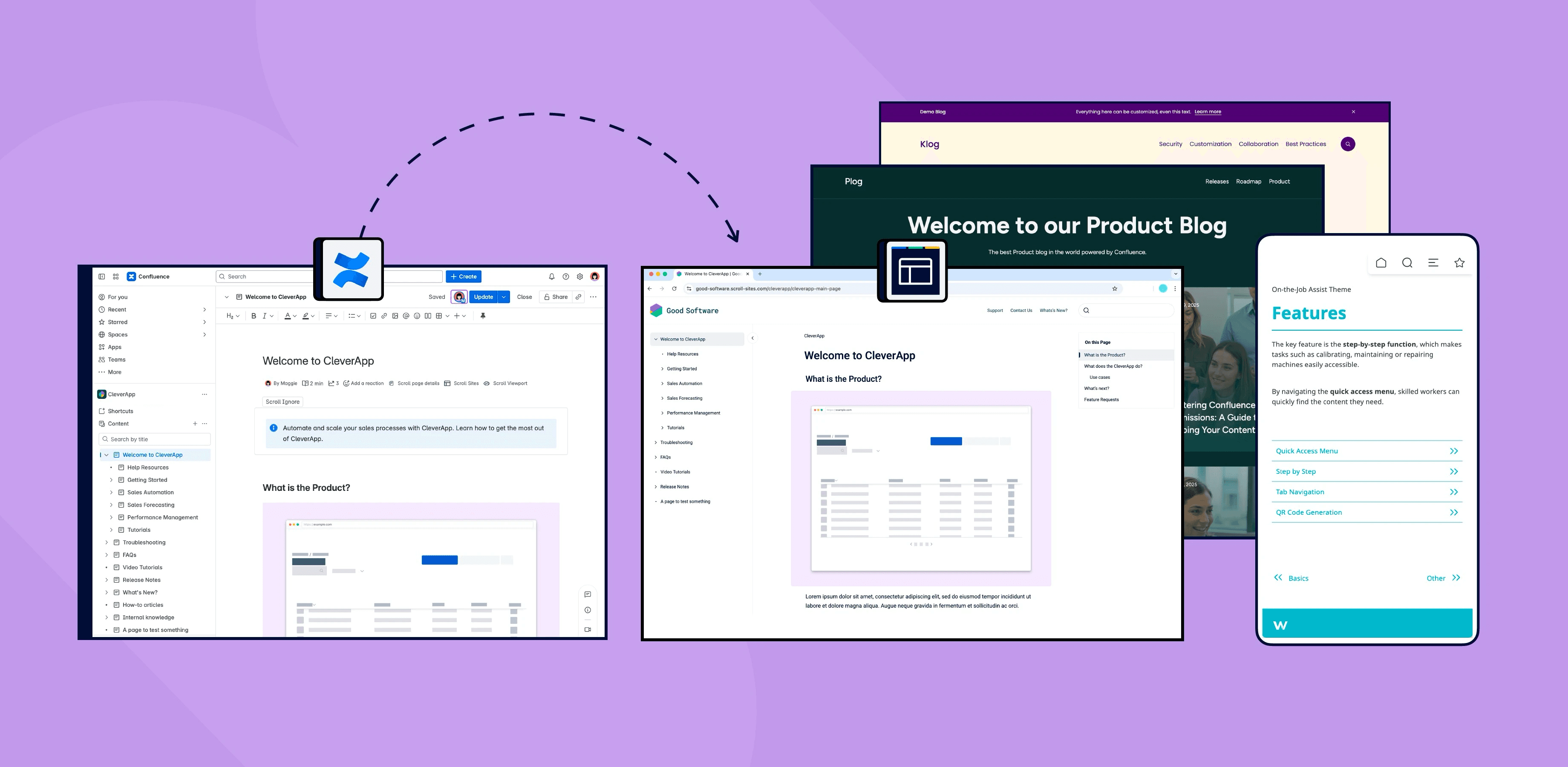
Scroll Sites is K15t’s site-publishing platform, turning documentation and content from Confluence into live, customer-facing websites — the backbone behind countless companies’ public help centers and knowledge bases.
I joined the redesign as it moved from Scroll Viewport to Scroll Sites, stepping in to rebuild the design system and reshape the product experience end to end.
Problem Definition
Viewport had done its job for years, but it had reached the edge of what it could become. Customers kept asking for more than the platform could give them, and the team could see where the ceiling was: a rigid theming system with no room for custom development, and an architecture with no path toward the AI features everyone knew were coming next. The decision was made to rebuild, not patch, and to use that rebuild to make the product genuinely more intuitive along the way.
The Process
Every project at K15t starts the same way, with a proposal. Ours went up on Confluence, was reviewed by stakeholders and advisors, and only then did design work begin.
From there, the shape of the work followed a pattern I’ve come to trust.
01.
Proposal & Alignment
02.
Fat Marker Sketches
03.
UX Concepts
04.
UI Design & Components
05.
Feedback & Iteration
06.
Implementation & Real Feedback
07.
Revamp
My role
I stepped into the project when our initial Product designer, who had set the original direction, moved into product management. A freelancer had already taken a pass at the visual design, but it wasn’t where the product needed to be. So I went back to the drawing board myself, rebuilt the visual direction, and rebuilt the system underneath it. From that point on, the UX and UI of Scroll Sites was mine to shape.
Opportunities discovered
01
A design system built to last
The inherited system leaned on an aging Figma plugin and outdated components. We saw a chance to move to native Figma variables and Auto Layout, cutting plugin dependency and speeding up both design and development.
02
Onboarding that doesn't leave people guessing
New users landed with little guidance on where to start. A clearer first-run experience and better empty states gave people a straightforward path to setting up their first site.
03
Navigation that matches a growing product
Viewport's structure had grown organically and no longer matched how the product actually worked. A cleaner information architecture meant less friction for users managing sites, pages, and settings.
04
Custom theming, opened up to developers
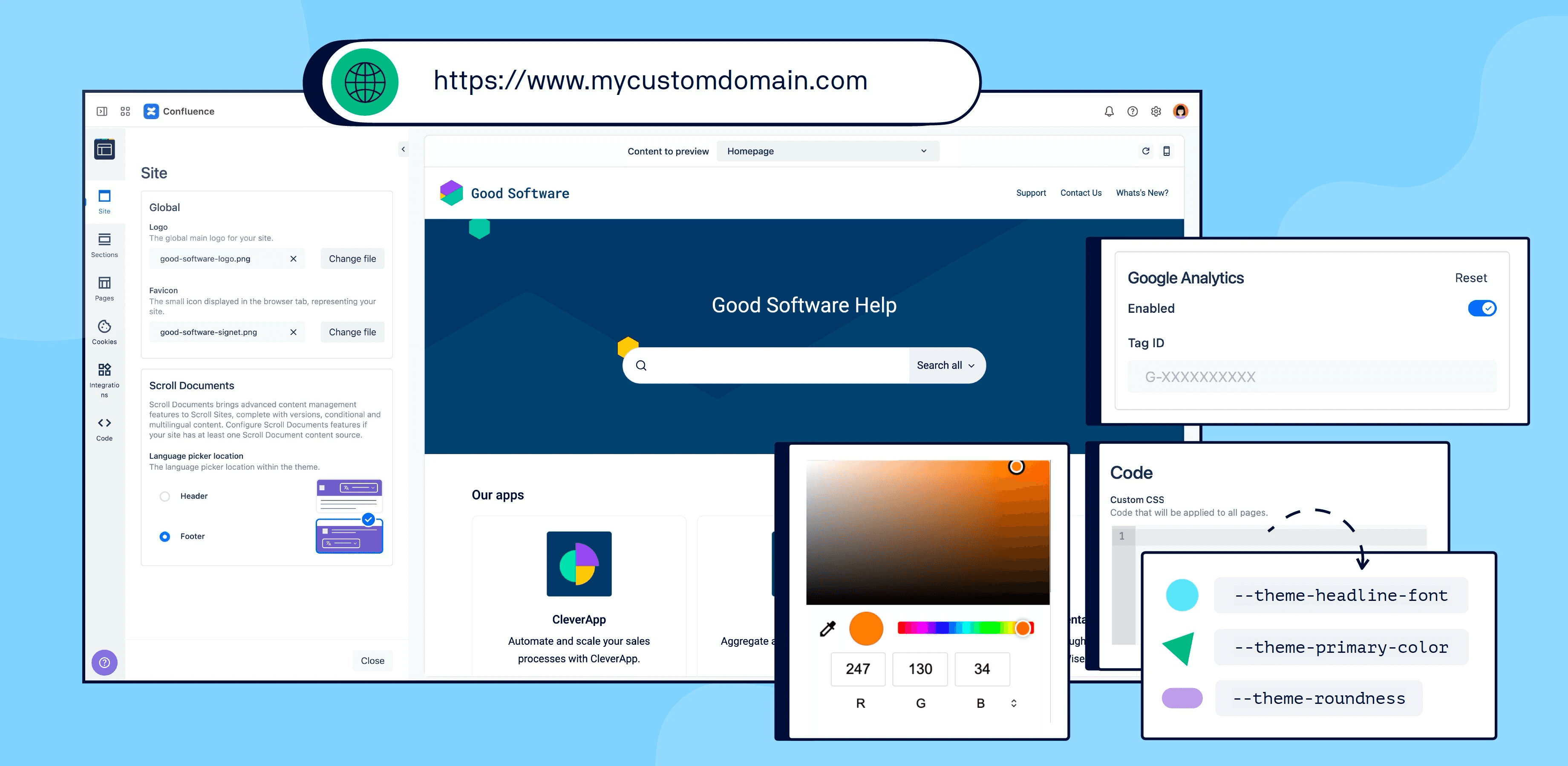
Viewport offered a fixed set of themes. Scroll Sites needed to support custom theme development, turning a closed feature into an extensible one external developers could build on.
05
Publishing that matches real workflows
Manual updates meant an extra step outside teams' existing Confluence approval processes. Introducing live updates let content sync automatically once approved, alongside the manual option for teams who wanted it.
06
A foundation ready for AI
Viewport's architecture couldn't support what was coming next. Scroll Sites was built with a foundation flexible enough to bring AI-driven features into the product down the line.
Design system rebuild
The system I inherited ran on Token Studio, a Figma plugin for managing design tokens. It worked, but it had aged badly. Every designer needed the plugin installed and synced just to open the file, and the components underneath hadn’t kept pace with what Figma itself could now do.
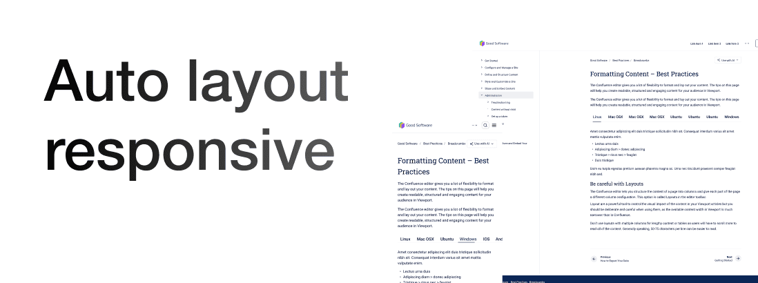
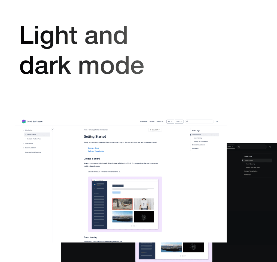

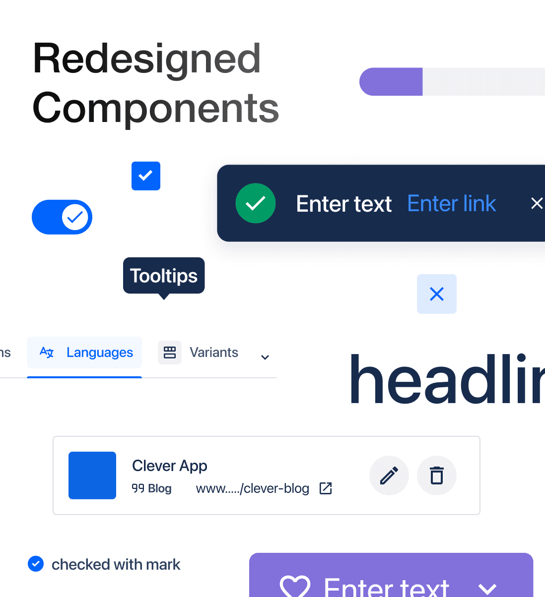
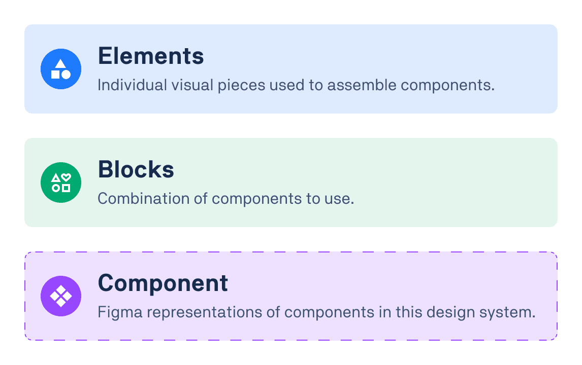
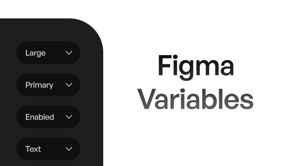
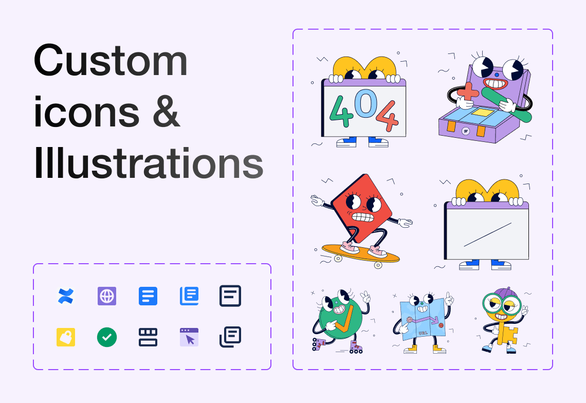
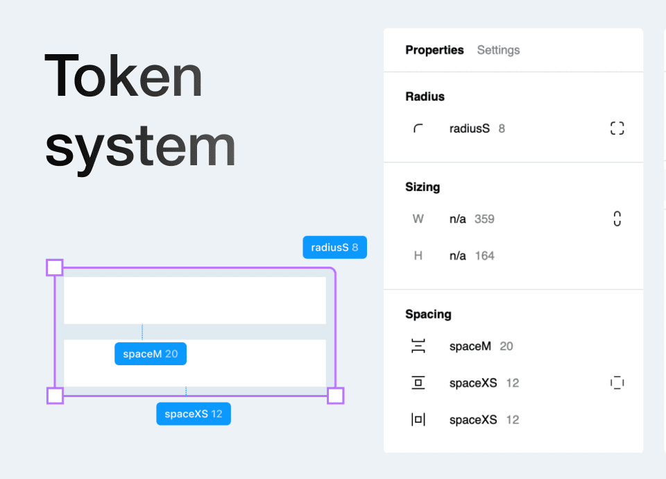
I migrated the entire token structure over to native Figma variables and rebuilt every component around Auto Layout, so things would resize and nest the way modern Figma expects. The real payoff showed up on the engineering side. Developers could read exact values straight from Dev Mode instead of asking me, and nobody needed a plugin just to inspect a color. Design and build both moved faster once that friction was gone.
Create site flow
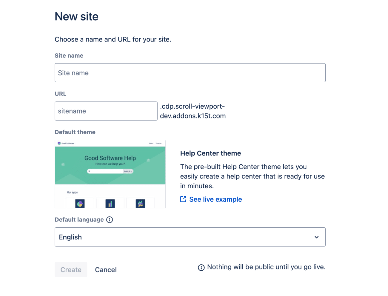
In Viewport, creating a site meant filling out one dense form. Name, URL, a single fixed theme, a language dropdown, all at once, before a user had any real context for what they were building.
Before
Fat Marker Sketches
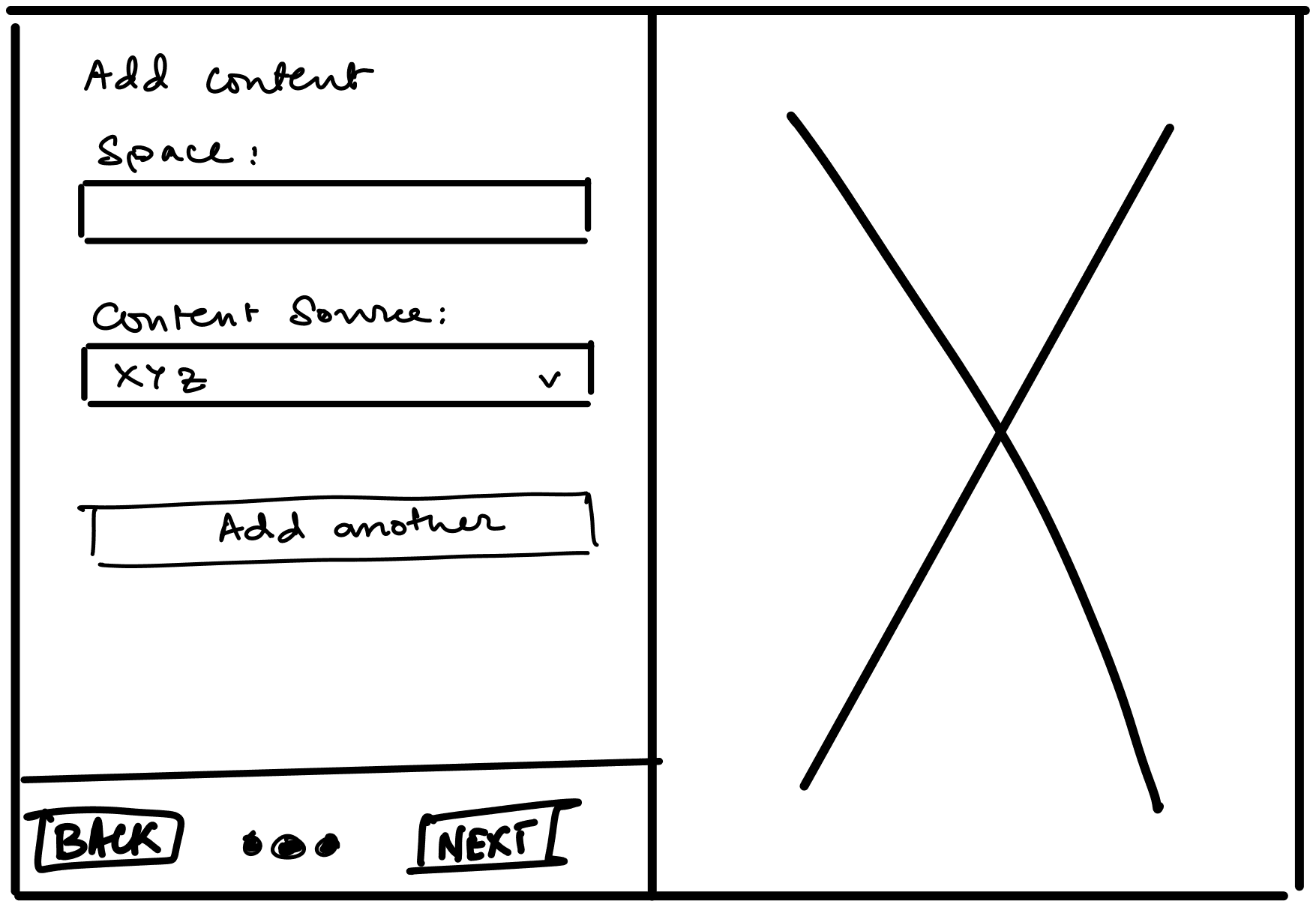
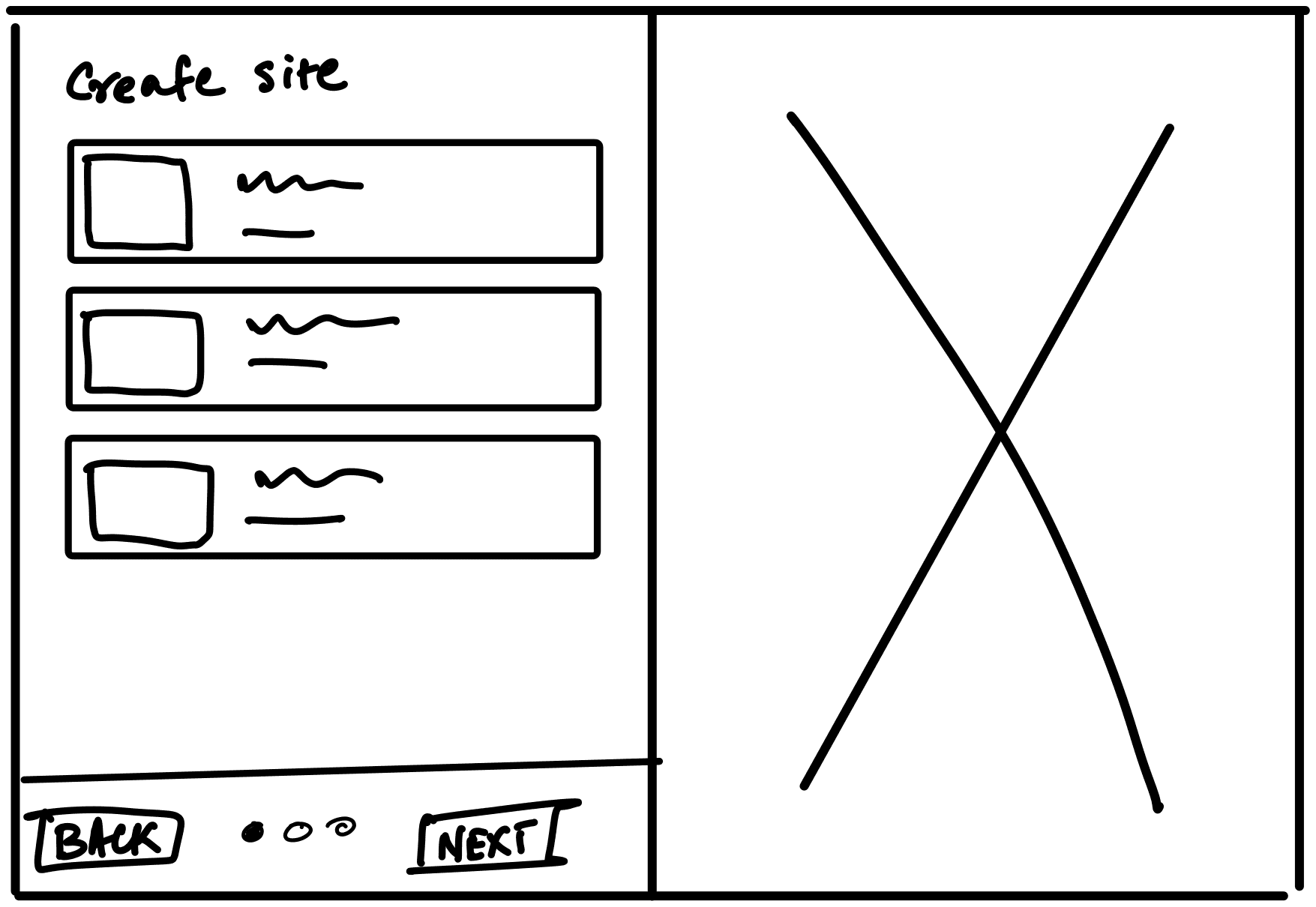
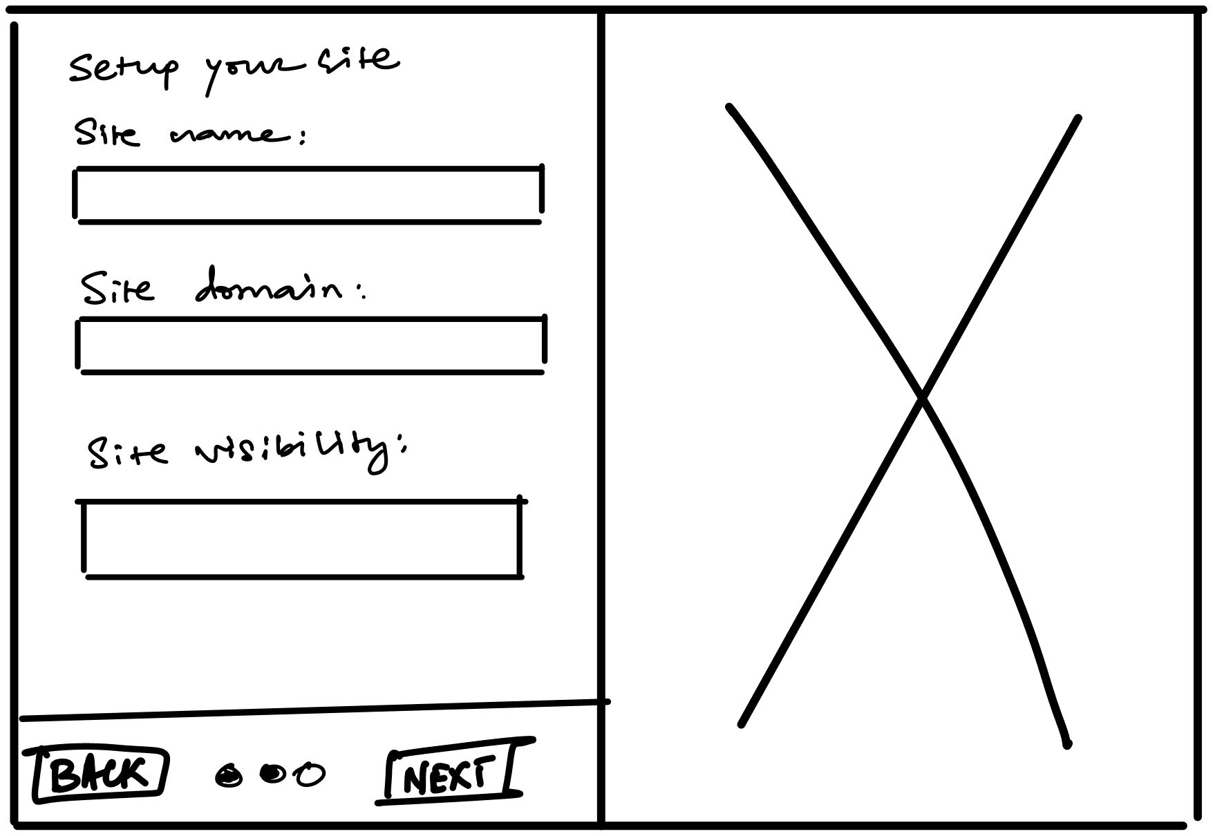
Early sketches broke that into a sequence instead. Choose a theme first, so there’s already something real to build against. Set up the site’s name and visibility next. Add your content last, once the site itself is ready to receive it.
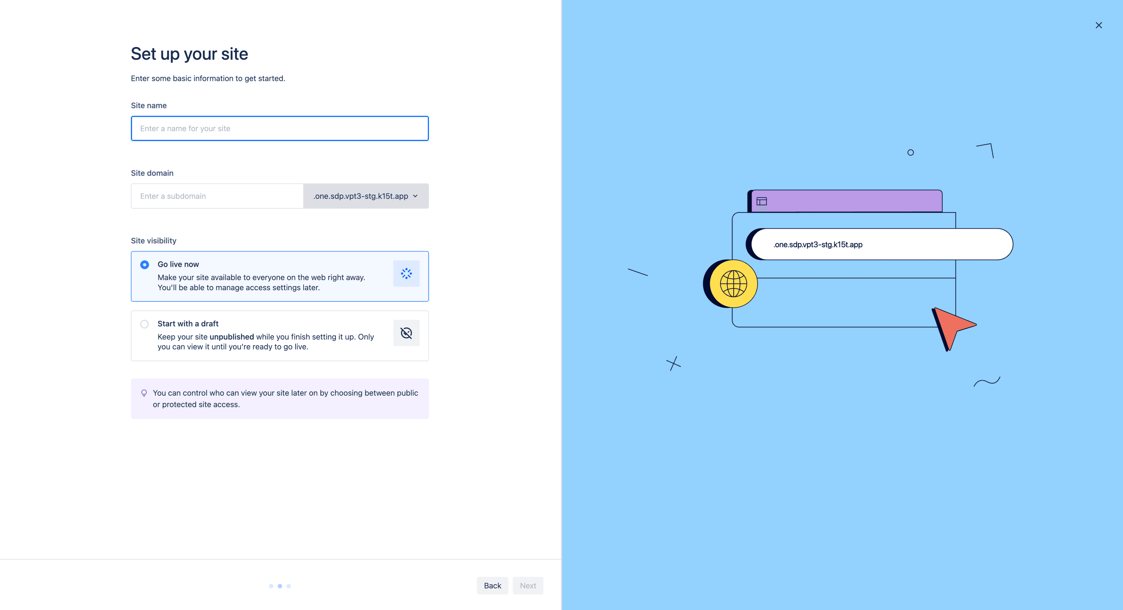
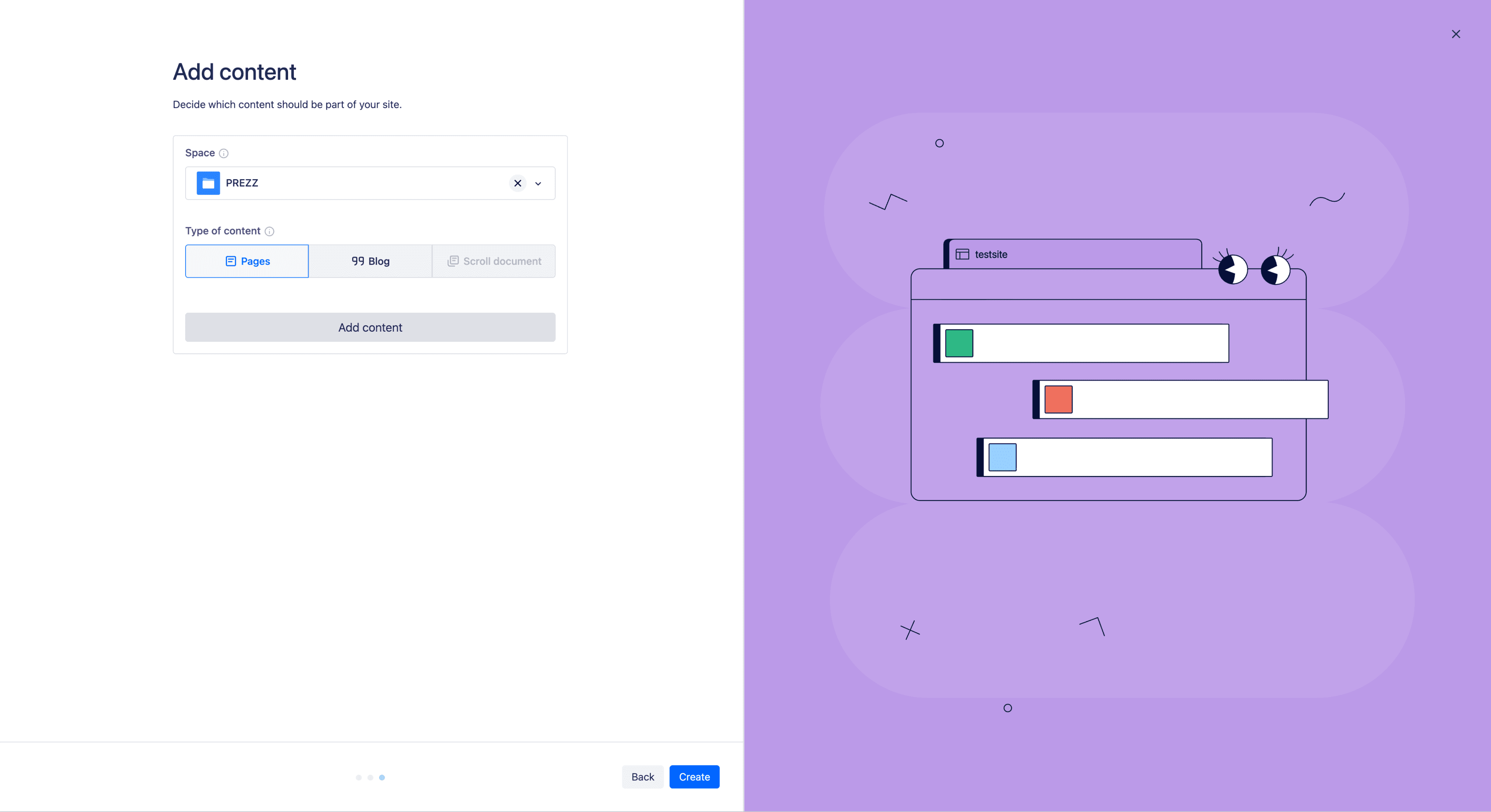
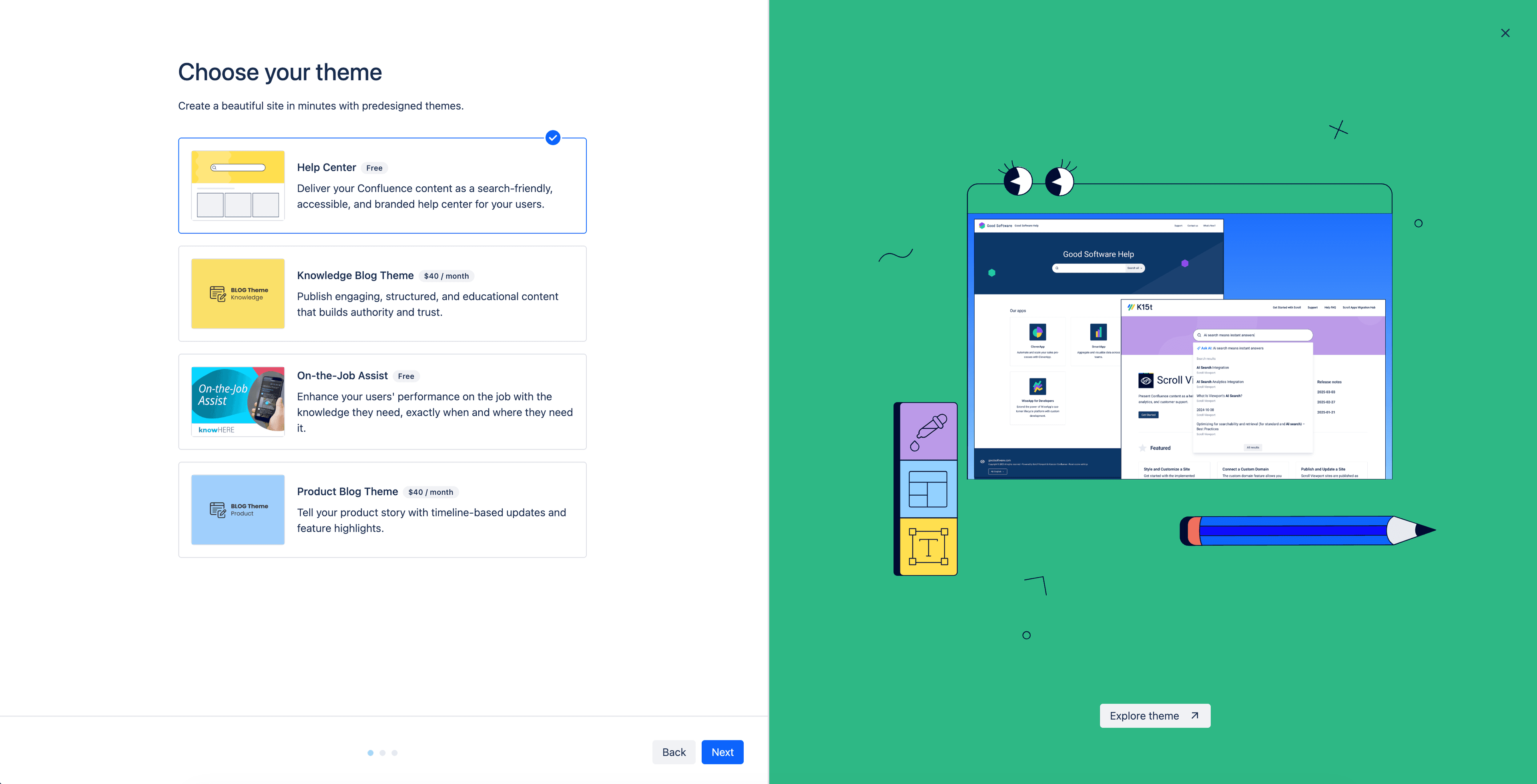
What had been one overwhelming screen became three focused ones, and folding theme choice into the flow itself meant custom theming wasn’t a buried settings option, it was there from the very first site anyone created.
My sites
Viewport’s home screen was a plain table: site names, raw links, a live or offline flag. It told you almost nothing about what any given site actually looked like.
Before
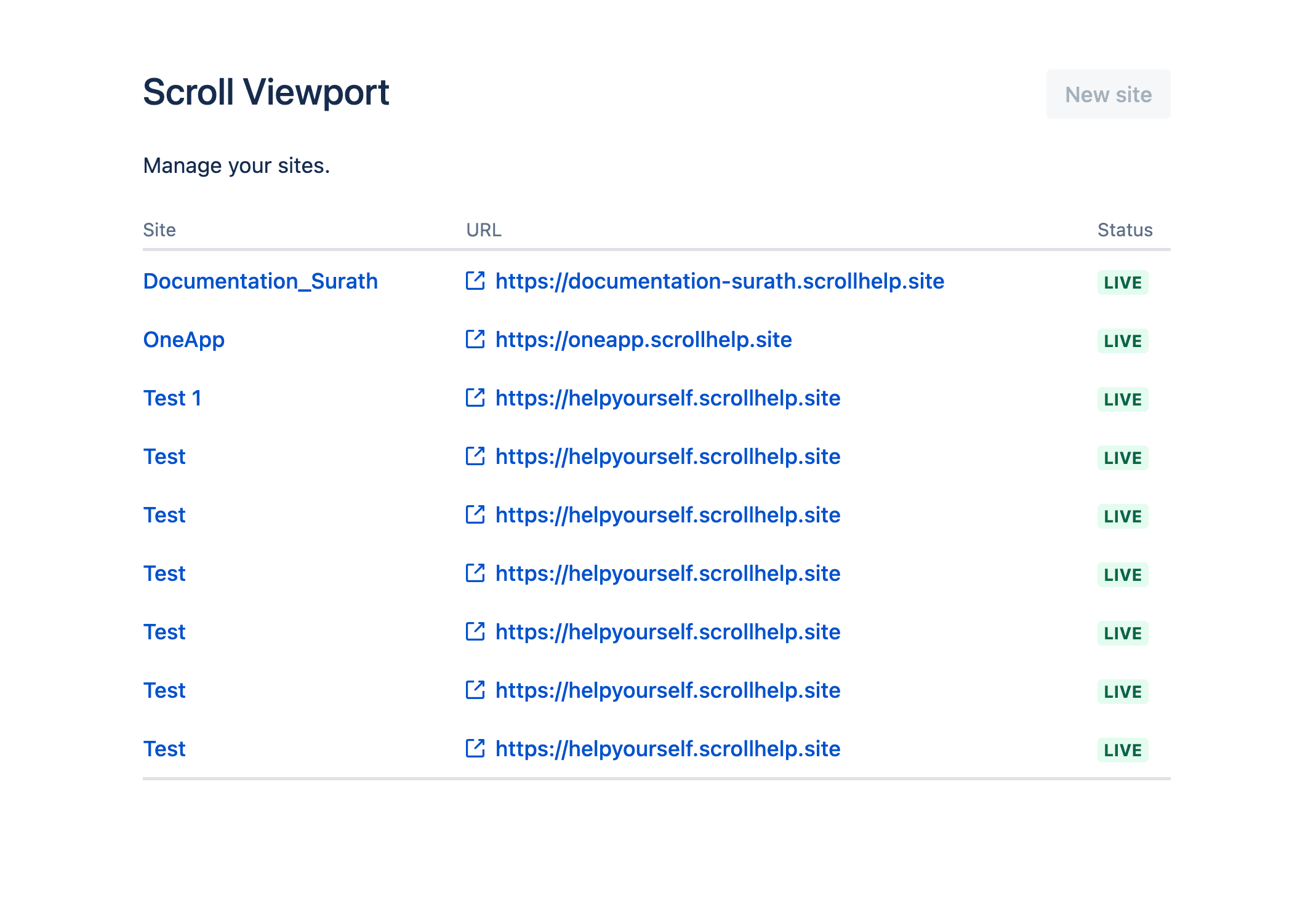
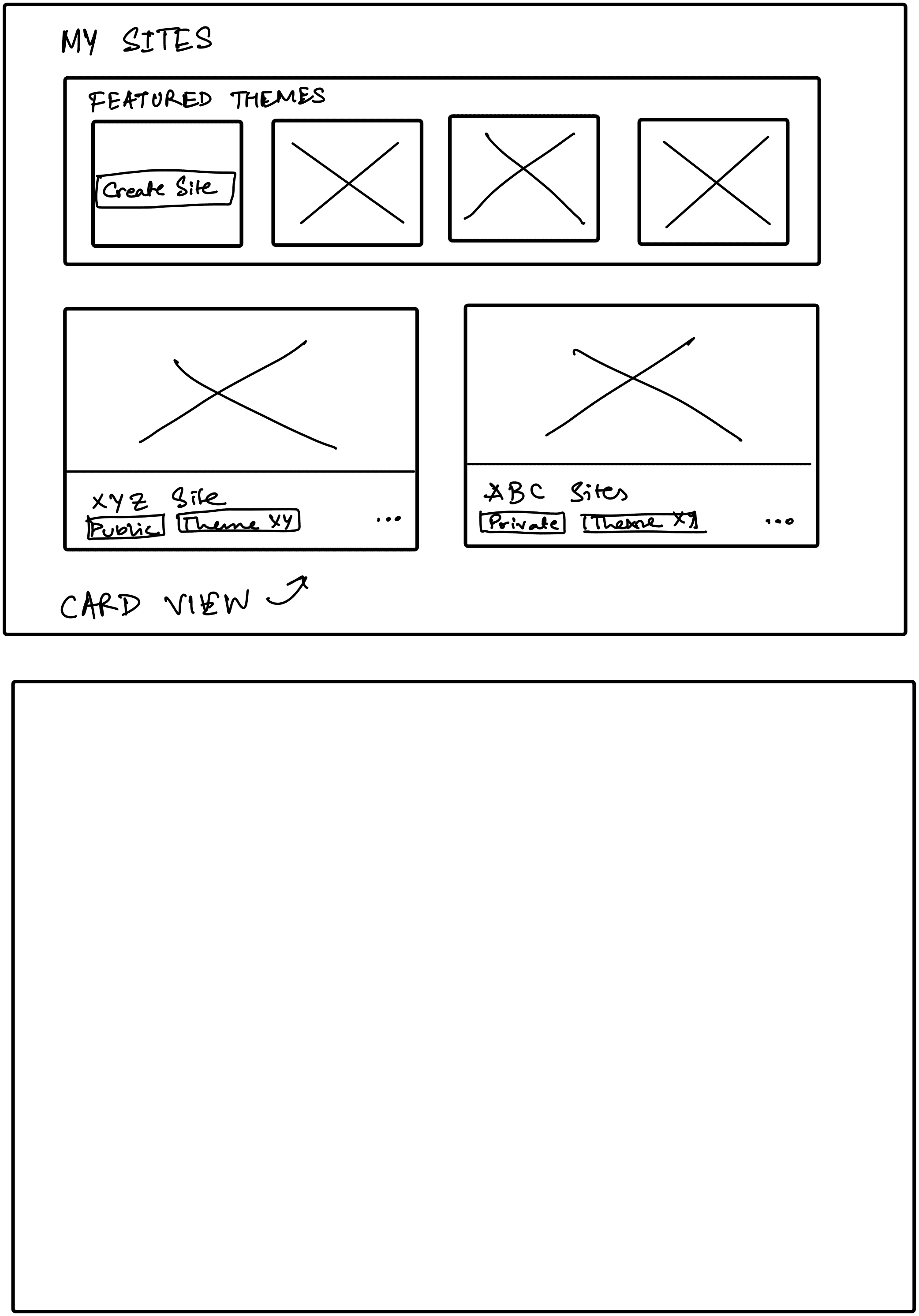
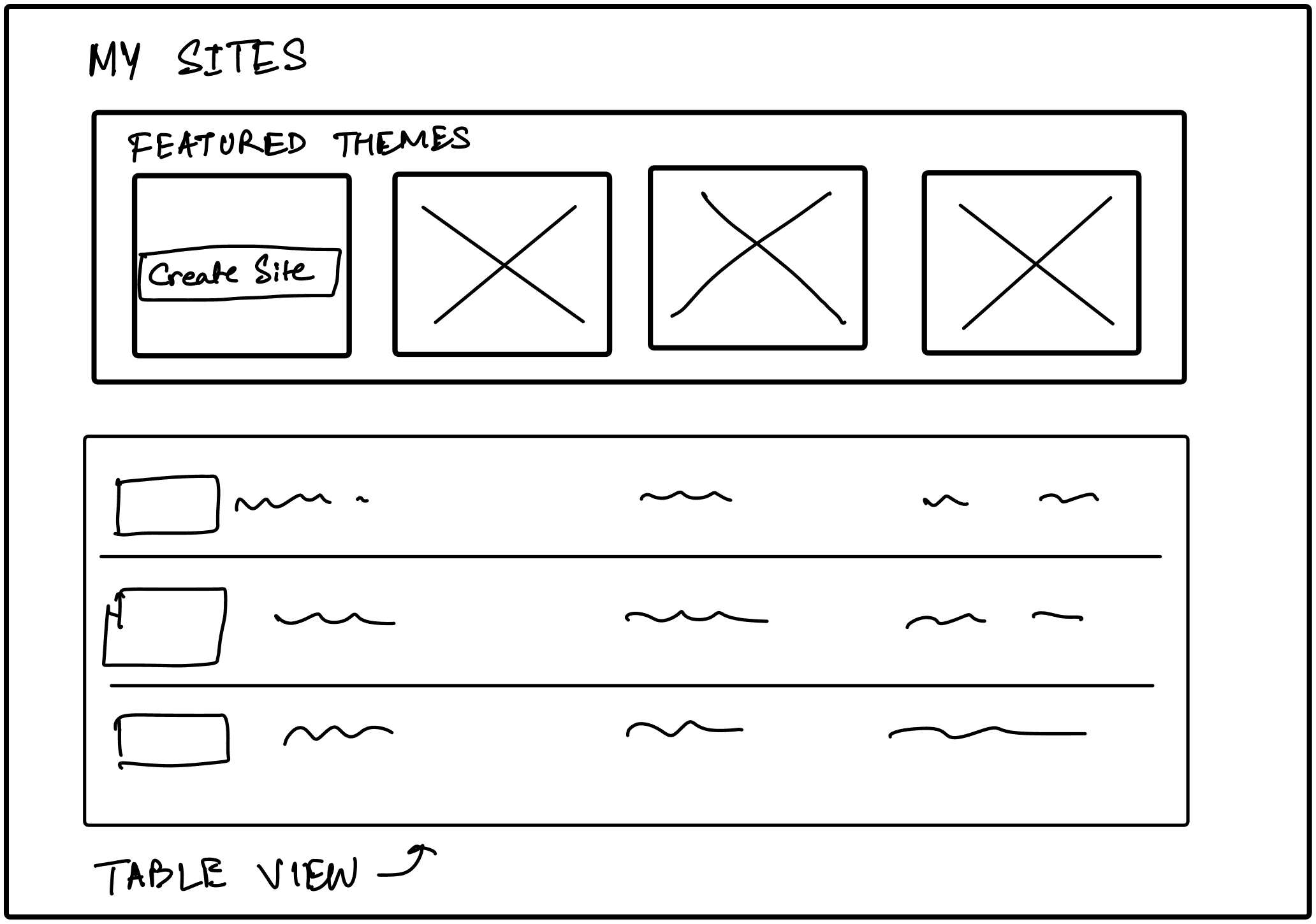
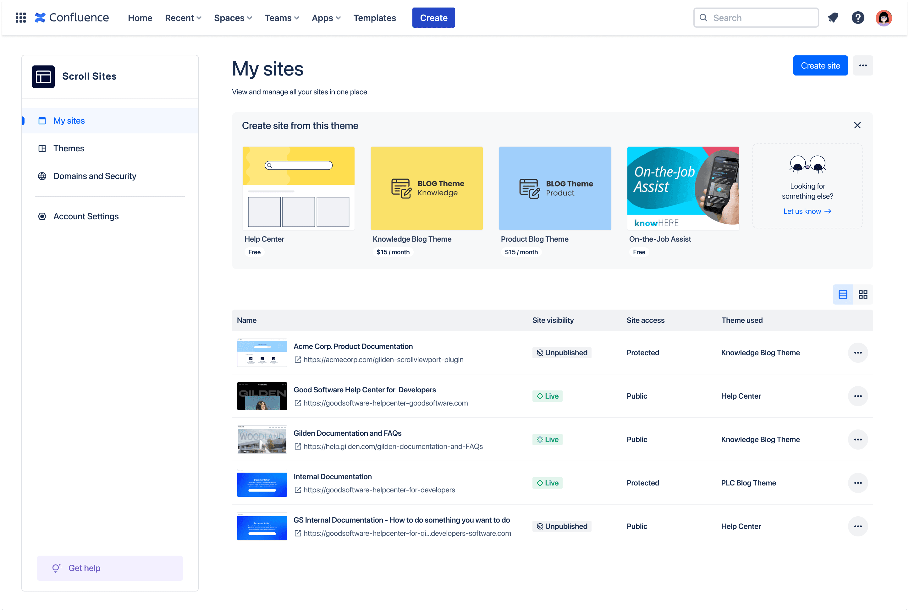
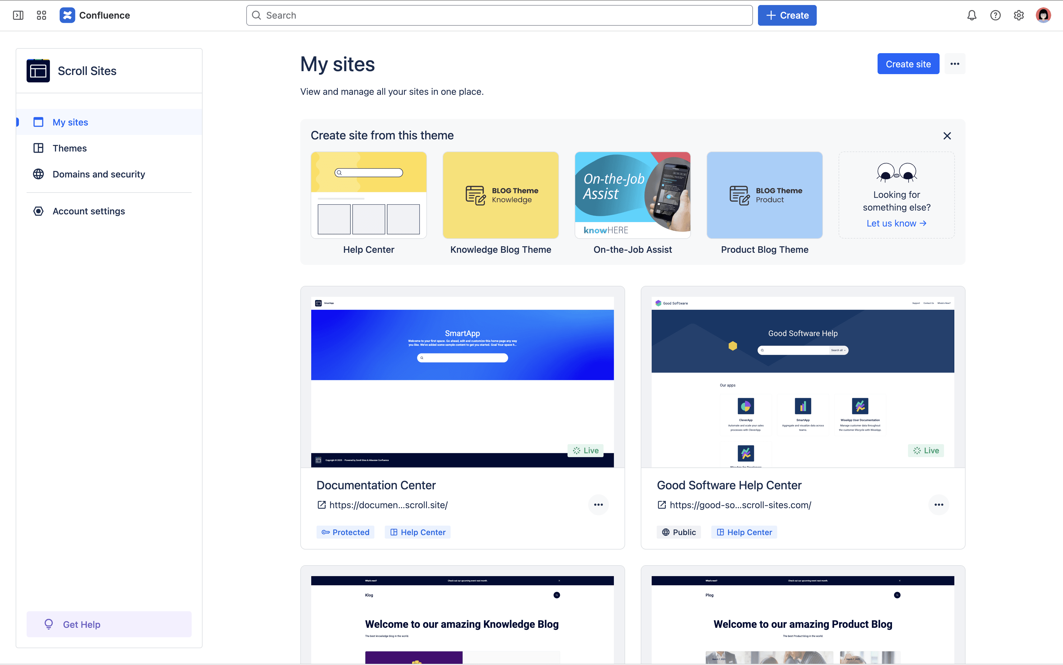
We sketched two directions early on, a dense list for quick scanning and a richer card view for browsing visually, and shipped both as a toggle. Every site now shows a live thumbnail, its visibility, its access level, and the theme it’s running, all at a glance. A featured themes row sits right on the landing page too, turning what used to be a passive directory into somewhere people could actually start something new.
Fat Marker Sketches
Publishing experience
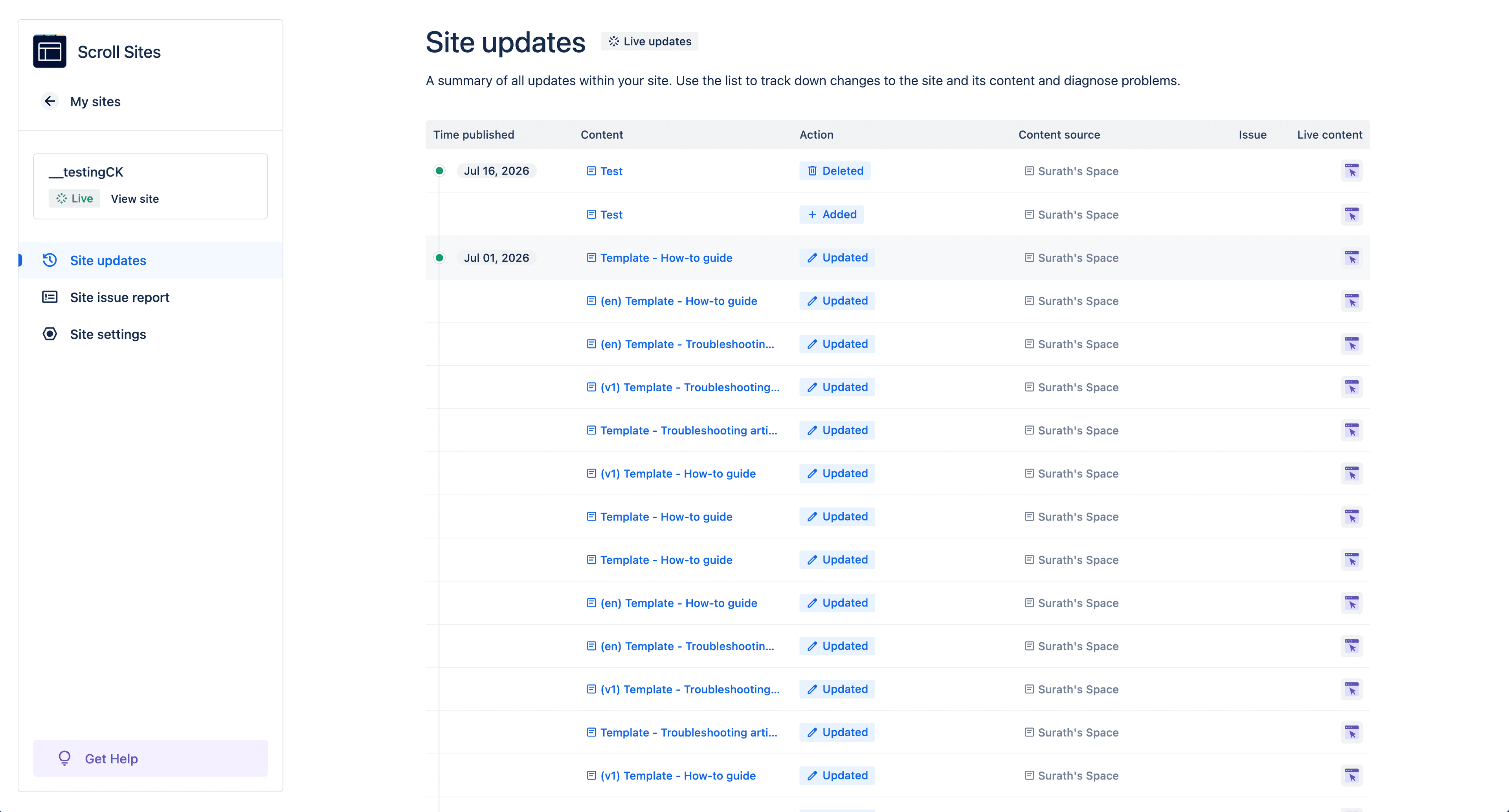
Viewport’s biggest daily frustration wasn’t a missing feature, it was an extra step. Every change made in Confluence needed someone to go back into the site UI and manually push it live.
For teams who already had an editing and approval process running inside Confluence, that meant finishing their real work and then remembering a second, disconnected task just to make it visible.
Live updates
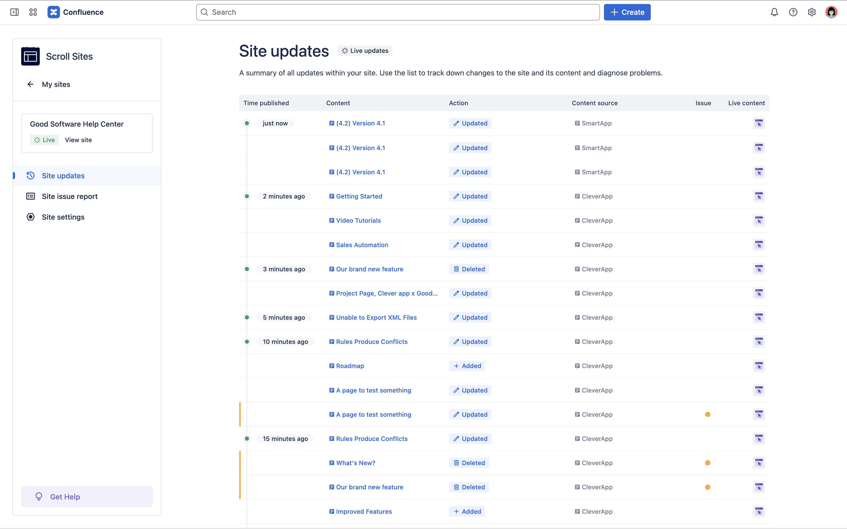
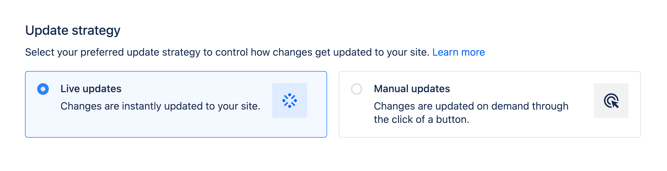
We introduced live updates alongside the existing manual option. Once content was approved in Confluence, it could sync to the live site on its own, no extra step required, while teams who wanted to review before publishing could still choose to. It’s a small mechanical change with an outsized effect on how the product actually feels to use day to day.
Site issue report
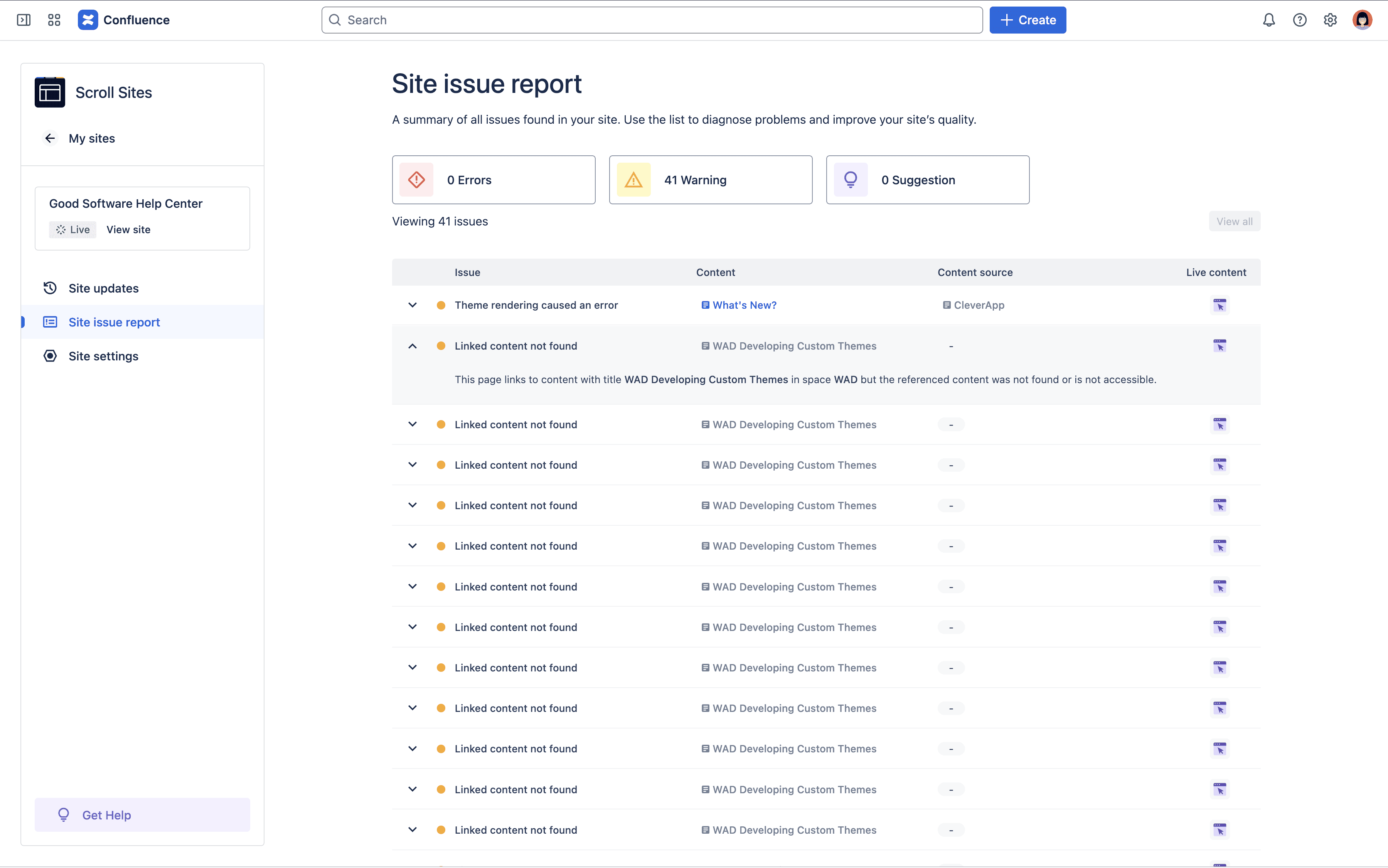
The site issue report scans a site and surfaces things like broken links and content references that no longer resolve, flagged clearly, tied back to the exact page and content source responsible.
Outcomes
Numbers only tell part of the story here, but they’re worth being honest about, including the part that didn’t move in a straight line.
0%
Growth in evaluation-to-subscription conversion after the relaunch
0% lower
Support tickets compared to Viewport, once the dust settled
0%
Of sites use live updates rather than manual publishing
0%
Of flagged issues get self-resolved through the site issue report, no ticket needed
0%
Faster completion of key tasks after the redesign
Other Projects.